
Compare variables using machine learning.
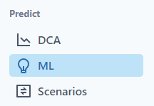
Click on the ML tab in Predict.
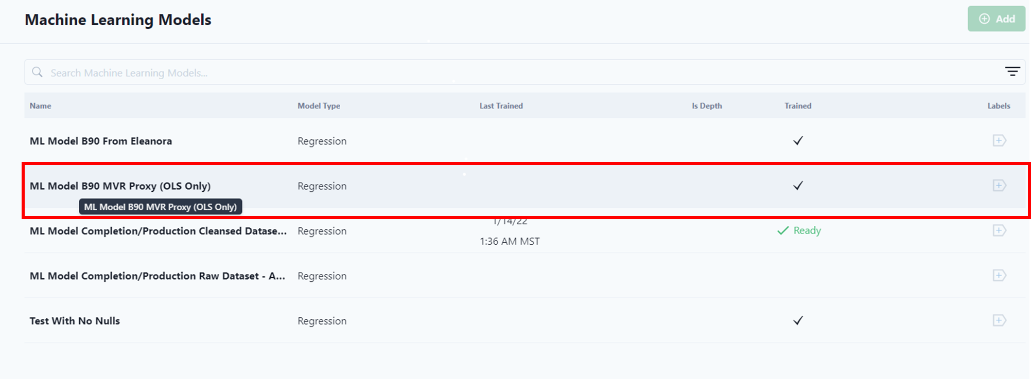
Notice that the user can easily see which models have been trained.
This ML article has the following categories:
Building a New Model
Select Add ML Model.
A pop-up menu allows the user to quickly start building a model.
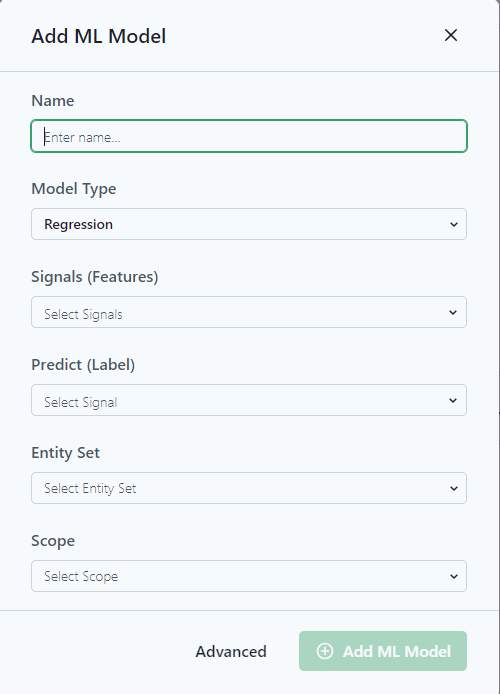
Notice the Advanced option at the bottom of the screen for more advanced options.
Name: Add a Name for the model. Try to be as descriptive as possible so other users understand the purpose of the model.
Model Type: Select the appropriate Mode. (For more information on Microsoft ML Models.)
Signals (Features): These signals are the variables that the model will use to predict an outcome.
Predict (Label): Predict is the signal the model is trying to predict, think about forecasts or when a failure might occur.
Entity Set: Group of entities to train the model.
Scope: Data or depth and time frame for training the model.
Advanced Options
Select the Model Type. (For more information on Microsoft ML Models.)
Information

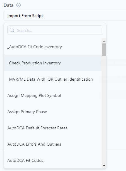
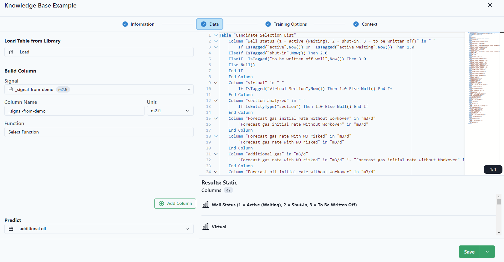
Data
Select the data.
Data can be selected from the drop-down menu from already written P# scripts.
Data can also be built directly from the Data tab. Here is where features and variables should be documented. Each column would be a feature in the model and the response from the features would be the "Predict" in the lower left.
Training Options
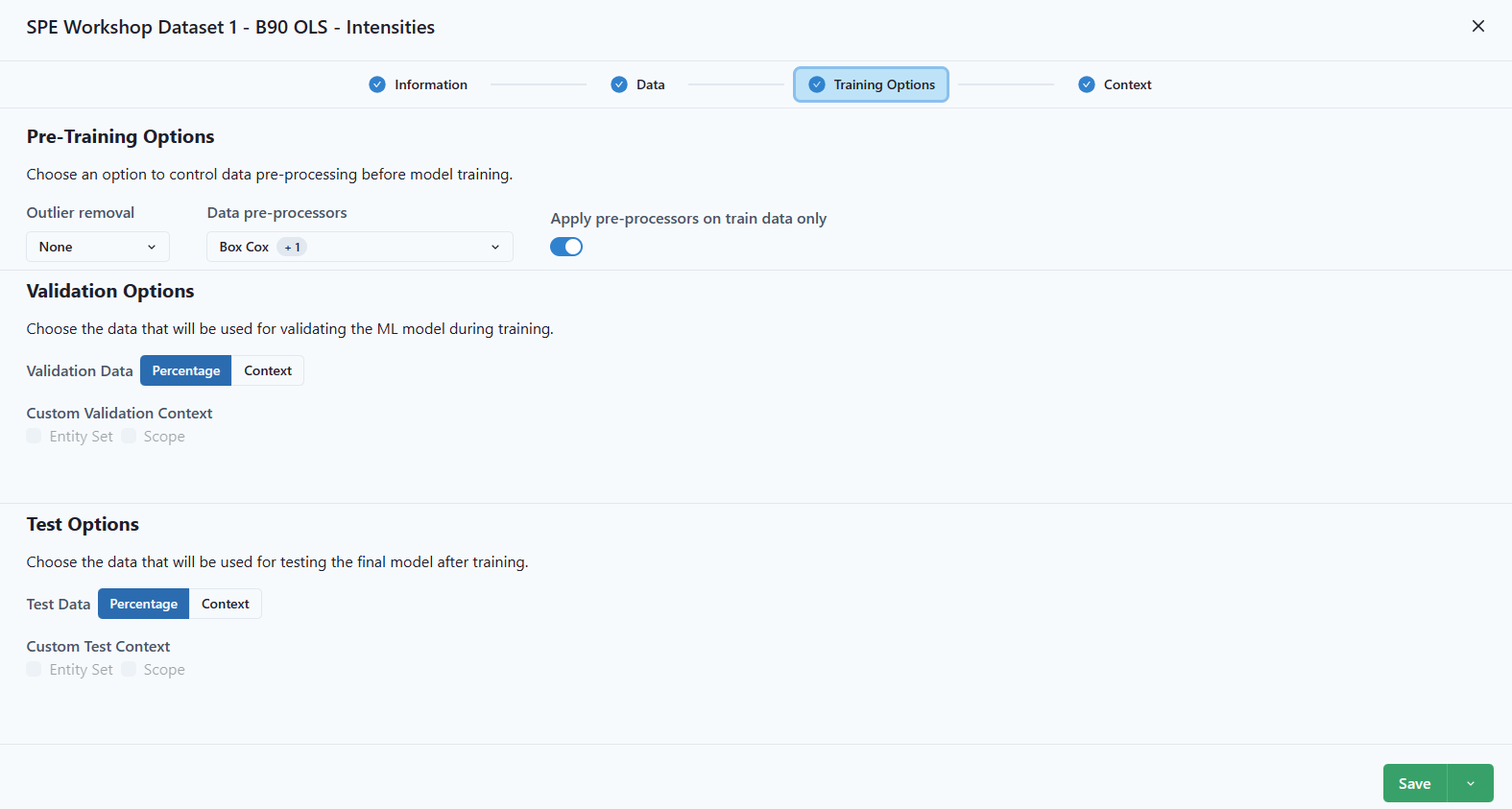
Choose Outlier Detection (Cooke's Distance, IQR, or none), Data pre-processing and whether to apply to train data only. An option for determining the best model would be to save each outlier detection as a model and compare the results. To do this, after adding the model, use the drop-down menu under Save and Save As.

Validation Options (Percentage or Context).
Test Options (Percentage or Context).
Context
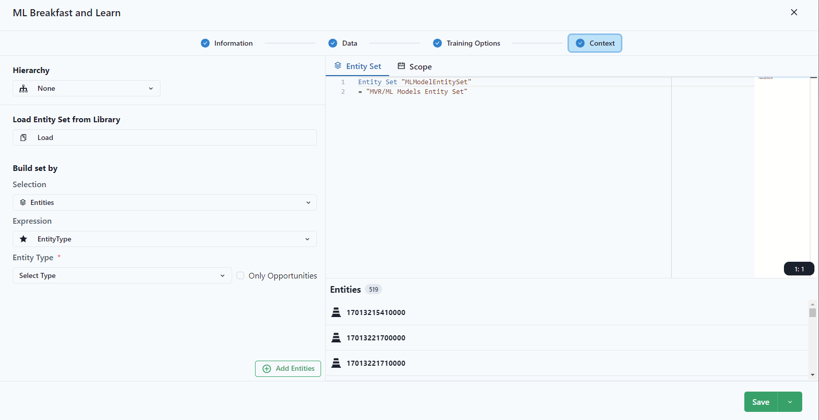
Select the Entity Set and Scope.
The Entity Set is the entity set used in models. It might not be the entire set of wells in the workspace. Select an entity set based on the parameters focused for the model training. For more information on creating an entity set, see static and dynamic entity sets.
Add ML Model.
Pre-Training
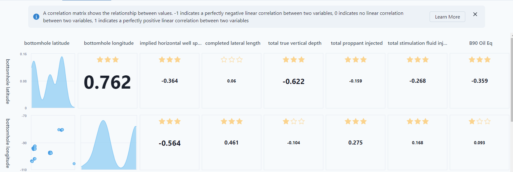
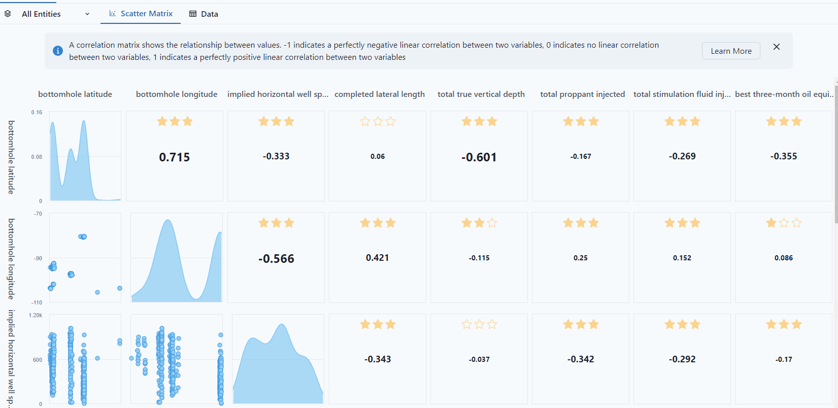
The model will open to "Pre-training" which will show the relationship between the variables selected in the model. The closer to 1, the more correlated data.
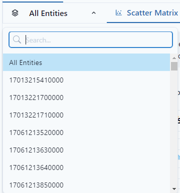
To select specific entities, use the "All Entities" drop down and select the specific entities for comparison.
Scatter Matrix
The "Scatter Matrix" presents the distribution for how each column compares to another column. For instance, bottomhole longitude is bimodule, whereas implied horizontal is more normal distribution.
Under the training options, turning on the outlier option will highlight the "outliers" in the view.
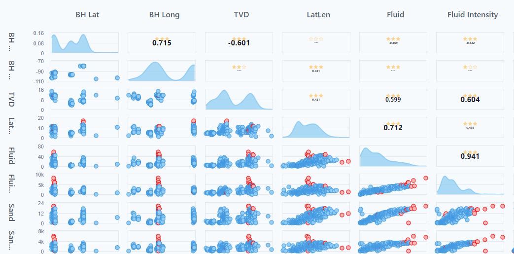
The stars in the matrix represent the p-value.
- 3 stars: p-value <= 0.001
- 2 stars: p-value > 0.001 and <= 0.01
- 1 star: p-value > 0.01 and <= 0.05
- No starts: p-value > 0.05
Notice, the bottom row is the response feature, the "Predict" from the building a new model. It shows the relationship between each variable and the Predict feature.

If there are two distinct areas on 1 variable, the best practice would be to separate out that data into different entity sets because it's not a continuous variable, and a regression type would not work.
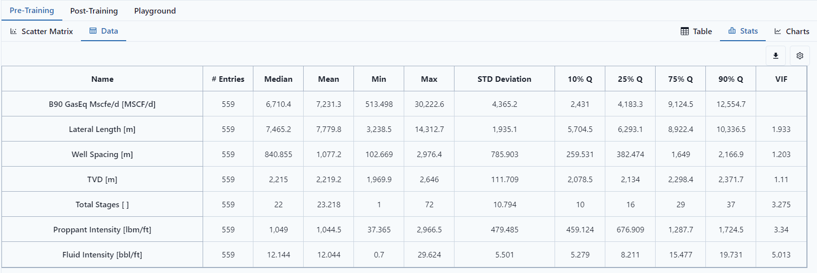
Data
The statistics view gives number of data points and some descriptive statistics. In this data tab, turning on outlier exclusion will display different number of data points.
Clustering and Ordination
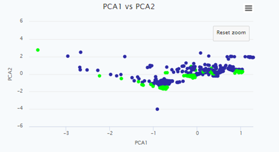
PCA 1 vs PCA 2 Scatter Plot
The PCA 1 vs PCA 2 Scatter Plot is a two-dimensional representation of a dataset obtained through PCA. It visualizes the relationship between the first and second principal components of the data. This plot allows you to observe patterns, clusters, or trends in the data that may not be apparent in the original feature space.
The scatter plot provides insights into the structure of the data by visualizing the relationships between variables in a reduced-dimensional space. Clusters or groups of similar data points may appear as distinct patterns in the plot, allowing you to identify underlying structures or potential outliers. It is important to note that the interpretation of these patterns should consider the scaling and nature of the original variables.
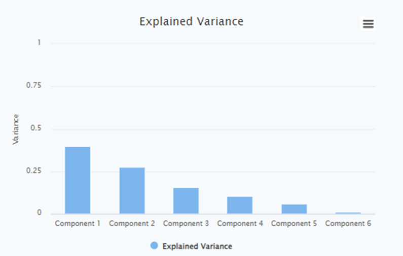
Explained Variance Bar Chart
The Explained Variance Bar Chart is a graphical representation that displays the amount of variance explained by each principal component in a Principal Component Analysis (PCA). It provides insights into the contribution of each principal component to the overall variance in the data set. This chart is particularly useful for understanding the relative importance of each component and determining how many components are needed to adequately represent the data.
By examining the chart, you can observe the cumulative explained variance as you move from left to right along the x-axis. The chart typically displays a decreasing trend, with the first few components explaining a significant portion of the variance and subsequent components explaining less. This information helps determine the number of principal components required to capture a satisfactory amount of information from the original data.
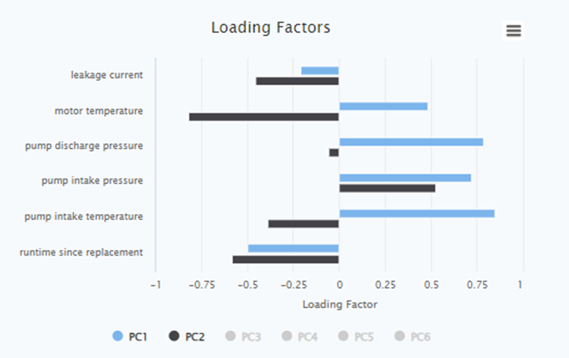
Loading Factor per Each Signal for All Principal Components
The Loading Factor per Each Signal for All Principal Components is a table that displays the weights or loadings of each original signals in each principal component obtained from PCA. It quantifies the contribution of each signal to the formation of the principal components.
During PCA, the original signals are transformed into a new set of orthogonal features called principal components. Each principal component is a linear combination of the original signals, and the loading factor represents the weight or importance of each original feature in the construction of the principal component.
By examining the loading factors, you can identify which signals have the highest influence on each principal component. Signals with higher absolute loading factors contribute more to the formation of the component and are therefore more relevant in describing the underlying patterns or relationships in the data.
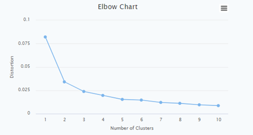
Elbow Chart
The Elbow Chart is a graphical tool used to determine the optimal number of principal components or clusters in unsupervised learning tasks, such as PCA or K-means clustering. It helps in finding the point of diminishing returns when adding more components or clusters does not significantly improve the model's performance.
An Elbow Chart is the distortion plotted against the number of clusters on the x-axis. The distortion measures the within-cluster sum of squares or similar metrics in clustering algorithms.
The Elbow Chart typically shows a decreasing trend in explained variance or distortion as the number of components or clusters increases. However, there is usually a point where the rate of decrease significantly slows down, resulting in a distinct bend or elbow in the chart. This bend indicates the optimal number of components or clusters to retain.
Using the Information for Storytelling about the Data
The combination of the Explained Variance Bar Chart, PCA 1 vs PCA 2 Scatter Plot, and the Loading Factor table provides valuable information for storytelling about the data. Here's how you can use this information effectively:
- Explained Variance Bar Chart: Identify the number of principal components needed to explain a significant portion of the data's variance. This helps in determining the dimensionality reduction and selecting the most informative components.
- PCA 1 vs PCA 2 Scatter Plot: Visualize patterns, clusters, or trends in the data after dimensionality reduction. Use this plot to identify groups of similar data points or potential outliers, which can inform the story behind the data.
- Loading Factor table: Analyse the contribution of each signal to the principal components. Highlight the signals with the highest loading factors for each component to emphasize their importance in the dataset.
- Elbow Chart: Determine the optimal number of principal components or clusters to retain. This assists in finding the right balance between complexity and information retention in the data analysis or modelling process.
By combining these visualizations and analysis techniques, you can effectively communicate the key insights, relationships, and structure present in the data to tell a compelling and informative story.
Training
To train the model, select "Training" at the top right of the screen.

More information on the theory behind different types of Machine Learning algorithms is available via the following link, at ML.Net task.
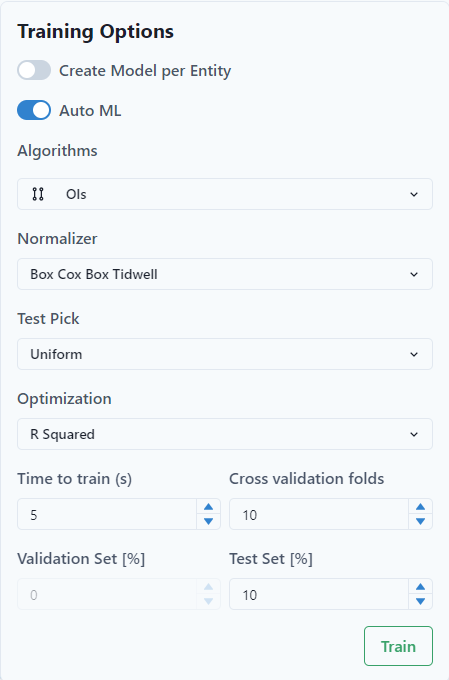
- "Auto ML." The use can choose Single Customizable ML Algorithm or AutoML. To use ONNX, turn off Auto ML.
- Select the "Algorithms." The user can choose multiple selections and the program will run the training for all of the algorithms and will choose the best performing as the final one.
- Select the "Normalizer." The normalizer moves the data to a common scale and helps with training.
- Select the "Test Pick."
- Select the "Optimization." It optimizes the data. In the example, "RSquared" is selected and is recommended as the default.
As a best practice, start with Mean Square Error. This optimization tends to create a better model over R2.
- Set up the "Time to train (seconds)." Usually, 10 to 200 seconds are enough to train the model.
- Set-up the number of cross-fold validation sets or the % of the dataset that will be used for validation. Recommendation is not to use more than 4 for smaller entity sets. If a larger number is selected for cross validation, the validatation set is selected automatically by ML.net.
Notice at the top of the selection screen, there is a toggle for "Create Model per Entity." If the user selects the toggle, it will create a model for each entity. Select it if a global model does not suit the current purpose. This option requires more time for the training than the global approach.
Train / Validate / Test
In ML, the Train / Validate split is made after removing the test set. if you use >1 cross-fold validation or set validation to 0%, the ML software will pick a valid percentage. ML needs to have a validation set.
Example
The entity set has 100 points. The test set is selected first. From the remaining points, that is the training and validation set. The breakdown for the model training would be:
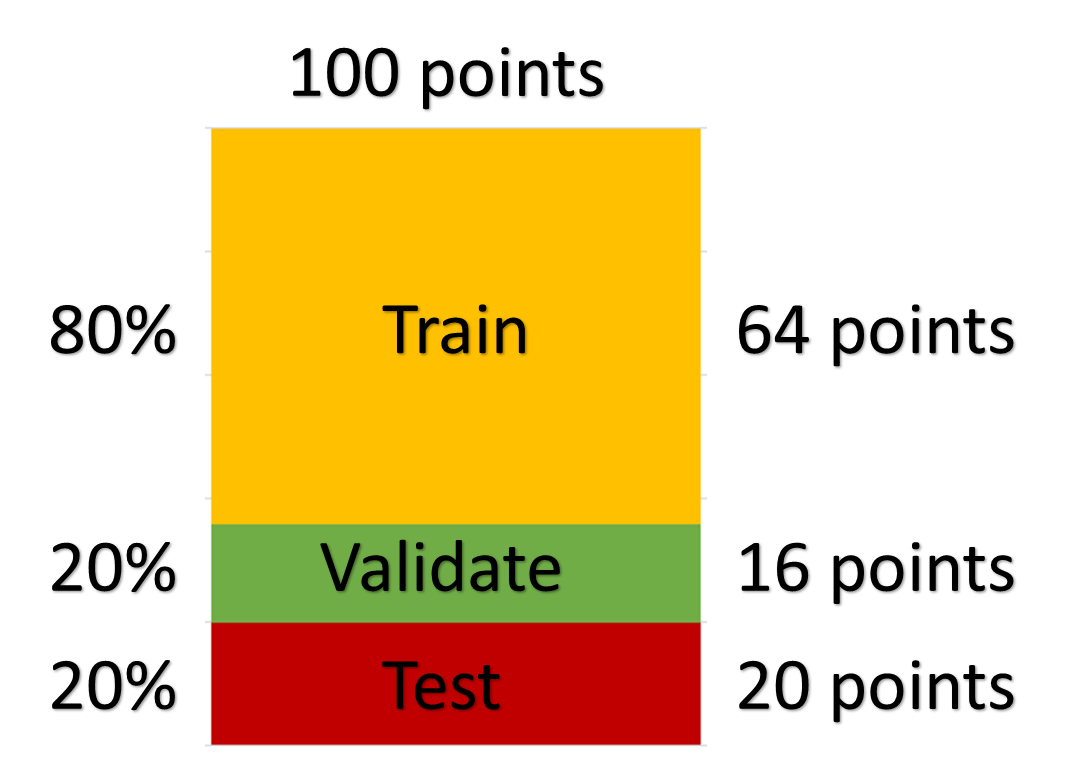
Default validation settings:
The platform uses autoML.NET library. The library performs automatic validation or 10 folds cross-validation during training:
- If there are less than 15000 rows in the training data-set, the platform is performing 10 folds cross-validation.
- If there are more than 15000 rows, the platform uses 10% of the training data for validation.
In machine learning, model validation refers to the process where a trained model is evaluated with a validation data set. It helps to select the best model based on the accuracy metrics between the real data and the predicted data at the validation scope, i.e. it helps AutoML to choose best model / algorithm throughout the training process.
If the user did not define the validation set during the creation of the model, he can define the percentage in this model training dialog (Training options). Or the user can define the number of cross validation folds.
Test set is not used by the algorithm in the training process, but it is rather an opportunity for the user to test a final model once more, like a “blind test”. The results for training, test and validation sets will be seen on final cross plot.
In k-fold cross-validation, the original sample is randomly partitioned into k equal sized subsamples. Of the k subsamples, a single subsample is retained as the validation data for testing the model, and the remaining (k − 1) subsamples are used as training data. The cross-validation process is then repeated k times, with each of the k subsamples used exactly once as the validation data. This is the way to test if the model gives satisfactory predictions for all kinds of input values of the features.
The platform has a default built-in validation setting; however, a user can specify a different one.
A user can perform validation by running the already trained model on a data set that was not shown to the algorithm during the training and comparing the results of the model with the measured output data.
Click Train
When the training is finished, the user will see a window with the list of trained models and values of optimization parameters for dataset, values of the optimization parameters for cross-folds validation and Feature Importance window.
The model that was considered the best by the system will have a check-mark symbol in the “Best Outcome” column. However, a user can highlight and save any other model of his choice (instead of the “best” one.)
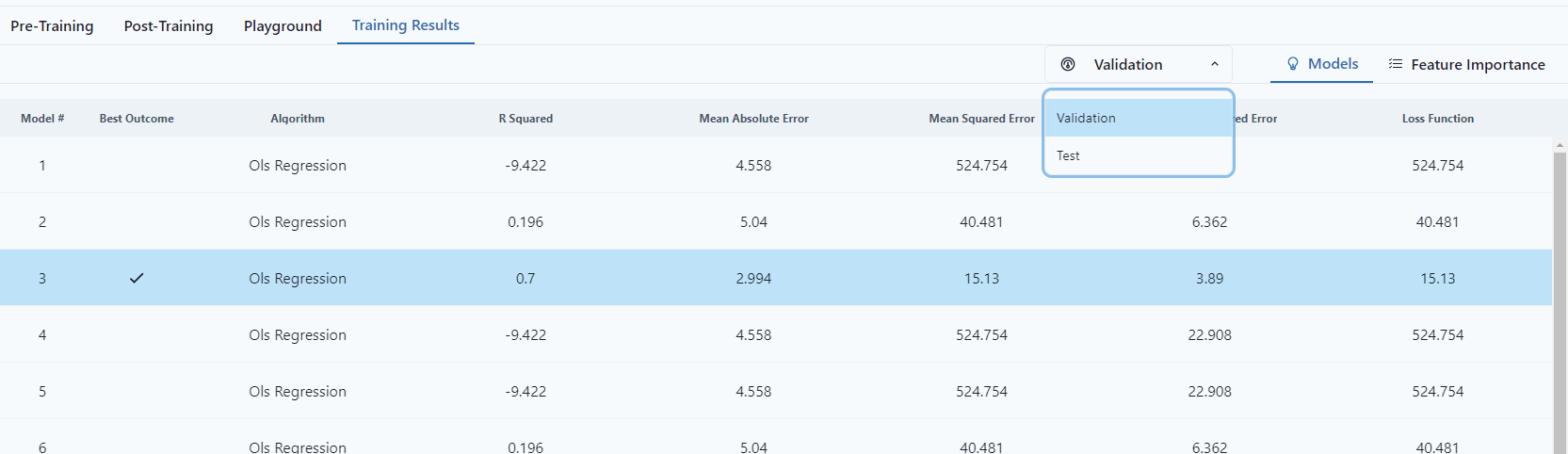
Notice that the "Best Outcome" changes depending on selection of Validation Type.
Save the Selected Model.
Once a model is trained, Post-Training is available.
Post-Training
When a model has been trained a light bulb will appear in the "Trained" column.
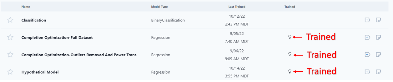
If the user clicks into an untrained model, the user will have to re-run the training.
The user can select, by click on the green select button or look at Feature Importance, which will give a correlation matrix of the variables after training.
Under the "Post-Training" tab, the user can cycle through the variables selected in the model training.

Summary

The Summary shows the algorithm, Training Time, Test and Validation data.
It starts showing correlations and the graph shows feature importance.
The user can visualize the data as a Summary, Feature Importance (Same from Training Results), ICE Plots, PDP Plots, Observed vs. Predicted, Single Variable, or as a Tree. Depending on the model, different plots will be displayed.
Feature Importance
Feature Importance gives statistical information about the variable importance in the model. The feature importance displays the table of the graph information from the Summary tab.
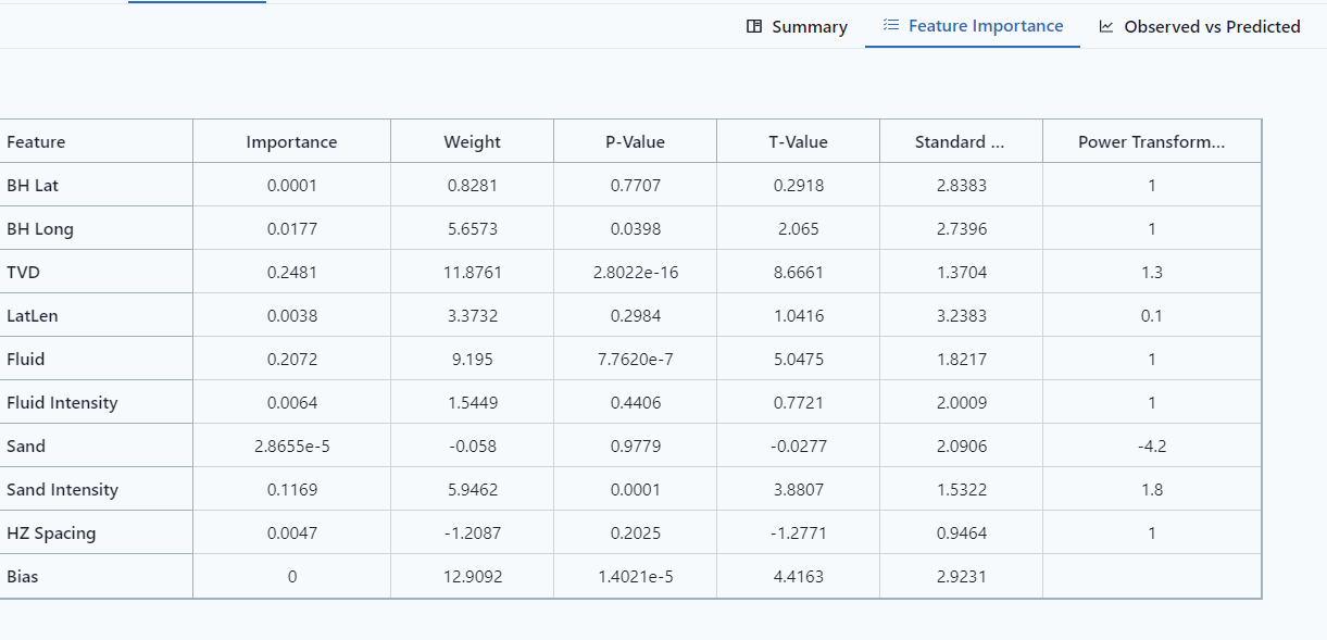
- Importance
- Weight - In y=mx+b, this is the m. It is the coefficient of the feature.
- P-Value - reflect significance of the variable.
- T-Value
- Standard Deviation
- Power Transformation - Define the best power coefficient to transform the data to a more normally distributed dataset.
- Bias - intercept on the response variable, it is the b in y=mx+b.
ICE/PDP Plots
ICE (Individual Conditional Expectation) is a method to analyze how a trained model behaves by generating predictions for fictitious data with varying input values. The green line (Partial Dependence Plot) shows the average effect of the chosen input signal on the model's predictions. ICE and PDP techniques provide insights into how specific input signals influence the model's output.
To interpret the results obtained from ICE and PDP analyses, it is crucial to consider the patterns observed in the visualization. The grey lines represent individual predictions for fictitious data points, showcasing how the model's output changes with variations in the chosen input signal. By examining the collection of these predictions, we can identify trends, nonlinearities, or interactions between the input signal and the model's response. The green line, representing the PDP, provides an overall average effect of the chosen signal on the model's predictions.
For example, a declined ICE and PDP analysis revealed that as the longitude decrease, the predicted value increase consistently.
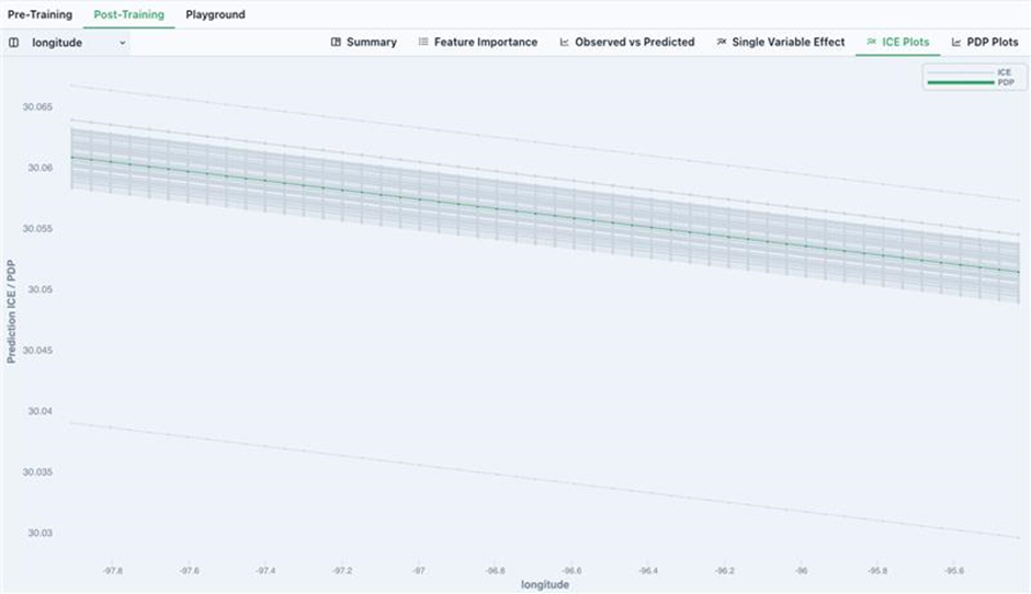
ICE Plots (Individual Conditional Expectation Plots)
ICE plots show the functional relationship between the model's features and the model's prediction, i.e., how the model will respond when a certain feature changes. The values for one line on the plot can be computed by taking one instance (a row in the dataset), creating variants of this instance by replacing the value of the feature in question with a wide range of interpolated values from a grid, then computing the model's prediction for all of the newly created instances. A different line would then correspond to the model's prediction for the created variants of another instance, and so on.
For more information on ICE Plots, see the ebook "Interpretable Machine Learning."
9.1 Individual Conditional Expectation (ICE) | Interpretable Machine Learning (christophm.github.io)
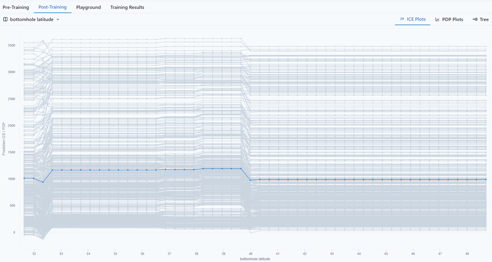
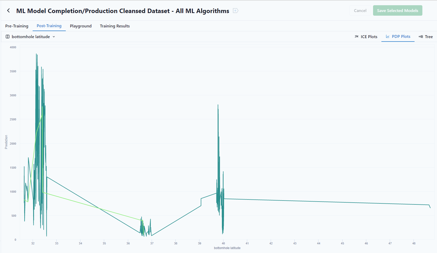
Bottomhole latitude vs. P90 Production
PDP (Partial Dependence Plots)
A PDP is the average of the lines of an ICE plot. These plots show how the average relationship between a feature and the model's prediction looks like. This works well if the interactions between the features for which the PDP is calculated and the other features are weak. In case of strong interactions, the ICE plot will provide much more insight, while a PDP can obscure a heterogeneous relationship created by interactions.
For more information on ICE Plots, see the ebook "Interpretable Machine Learning."
8.1 Partial Dependence Plot (PDP) | Interpretable Machine Learning (christophm.github.io)
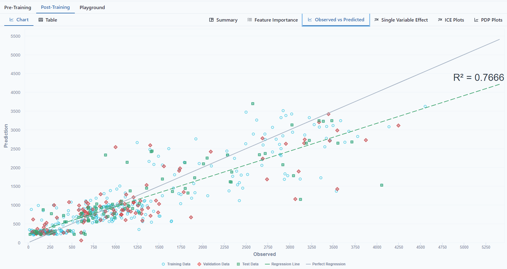
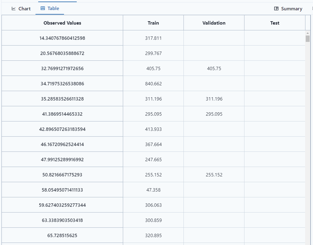
Observed vs Predicted
Notice the tab at the top left of the screen to view as a Chart or Table. It shows the Training Data, Validation Data, Train Data.
As a table (which can be exported by clicking  )
)
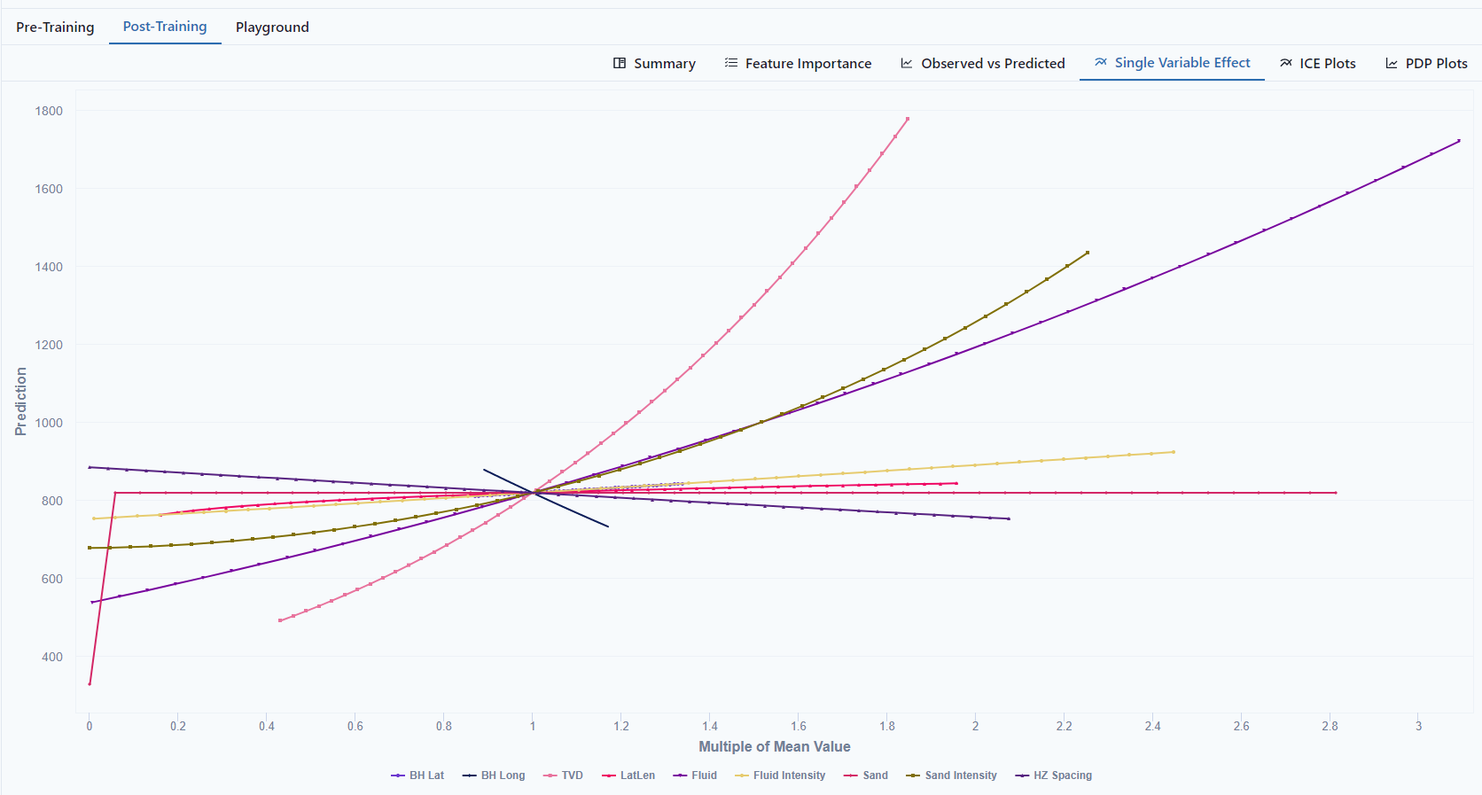
Single Variable Effect
View the effect each variable how on the model.
- If the line has curvature, there was a power transformation.
- The convergence is the average for all features is the average predicted value
- The slope of the line shows the influence on the outcome; the more sloped the line, the more it impacts the prediction.
- The less the slope (flatness), the less impact the variable has on the outcome.
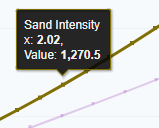 Hovering over a line, will show how the variable changes changes the prediction. In the example, 2x as much sand will increase the B90 by about 50%.
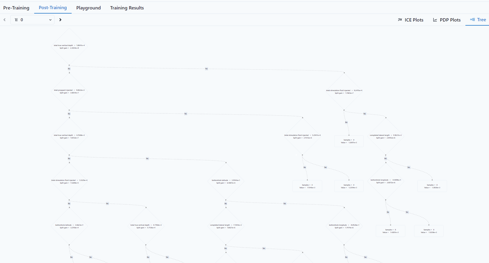
Tree
A Tree shows how the variables map to each other
Playground
The ML Playground compares the observed data, training prediction and playground predictions made from and ML model. The goal of this type of visualization is provide a picture of the relative means between datasets and where things sat with respect to distribution.
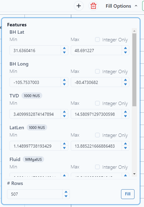
Any number can be used to populate the variables. Use the drop-down menu under fill options to select the min and max for each feature. Notice for specific items, "Integer Only" can be selected. An example would be perforation intervals, it's an integer only value.
Select Fill.
From the selected Features, the platform will make a prediction. When satisfied with the values for the variables, select Predict. 
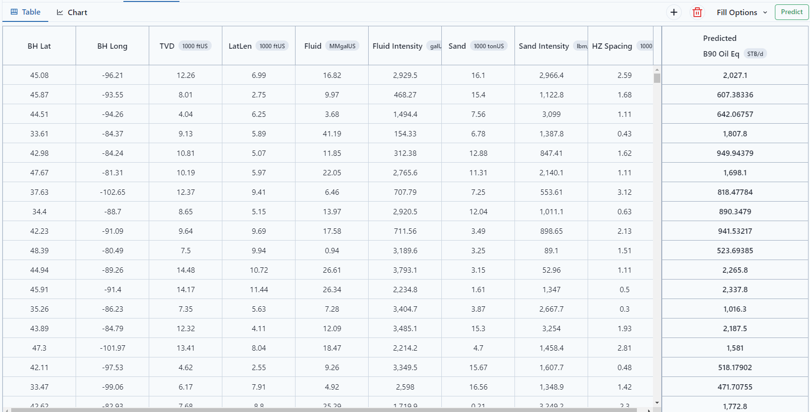
The values can be visualized as a Table or a Chart.
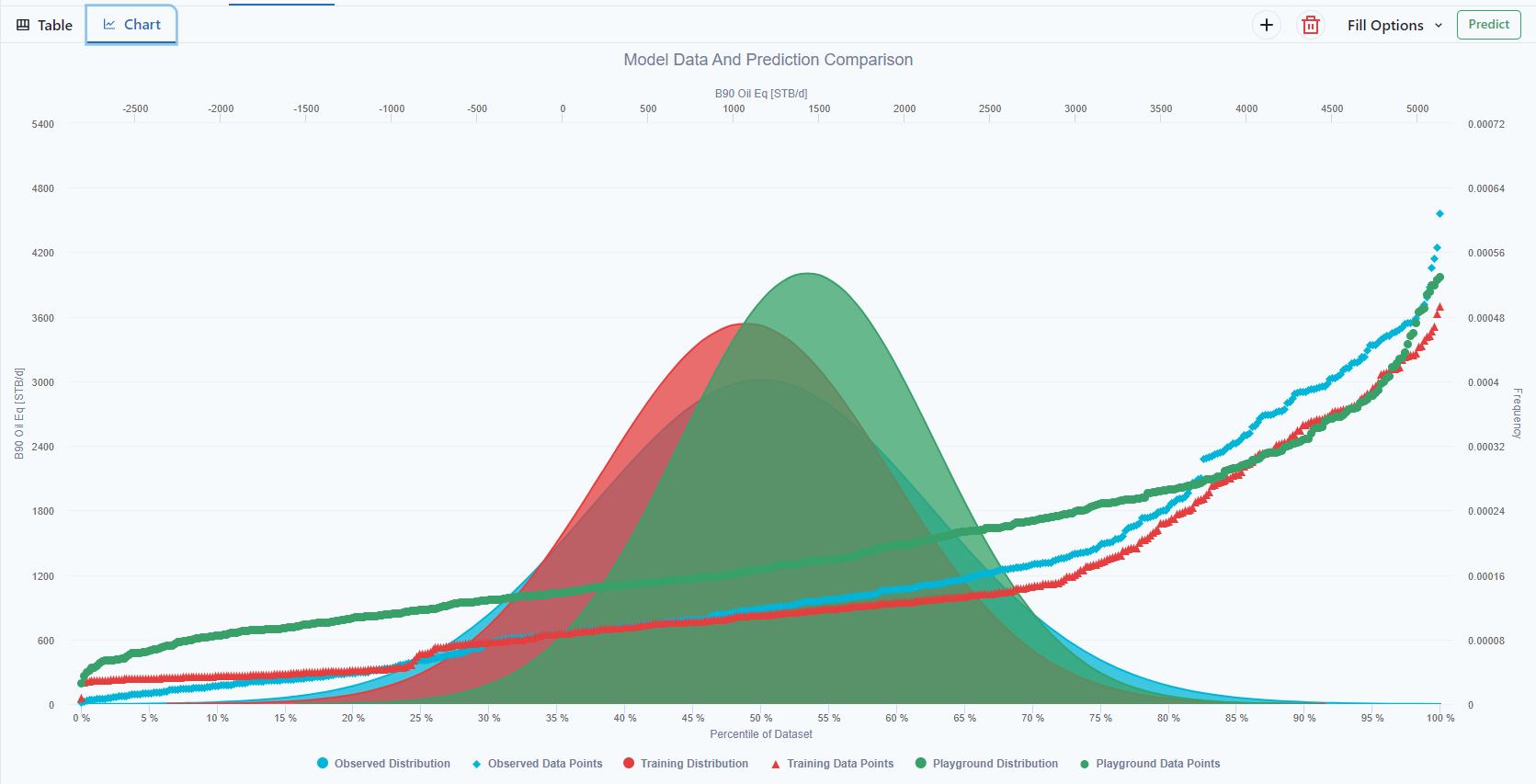
The chart shows the of the Observed vs Training vs Playground.
References
Molnar, C. (2022). Interpretable Machine Learning:
A Guide for Making Black Box Models Explainable (2nd ed.).
christophm.github.io/interpretable-ml-book/