Data Views can pulls specific data sets, view them as a table, stat, or chart. It also offers the ability to change values.
From the Navigation Panel on the left, click Data.
This article reviews the follow:
- Create a Simple Data View
- Save Data View
- Save Data View as P# Script or a Table
- Export Data
- Table View
- Transpose Data
- Statistics View
- Chart View
Simple Data View
To get started, select Entities and Signals. If a signal that is time dependent is selected, also select a scope (time frame) to view the data.

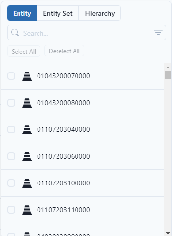
Entities
Data can be grouped by Entity (individually select one or more entities,) by Entity Set, or by Hierarchy. Under Hierarchy, the user can also select Entity Type.
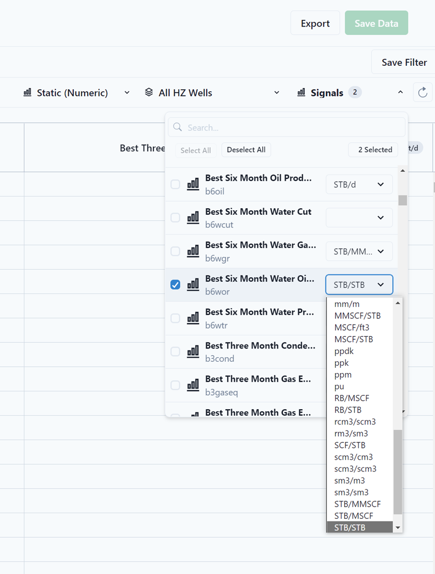
Signals
Signals are found by either scrolling through the available list or by typing through the Search box. In addition, the user can select/deselect multiple signals to analyze by interacting with the check boxes next to each signal of interest. The Deselect All button clears all the selected signals.
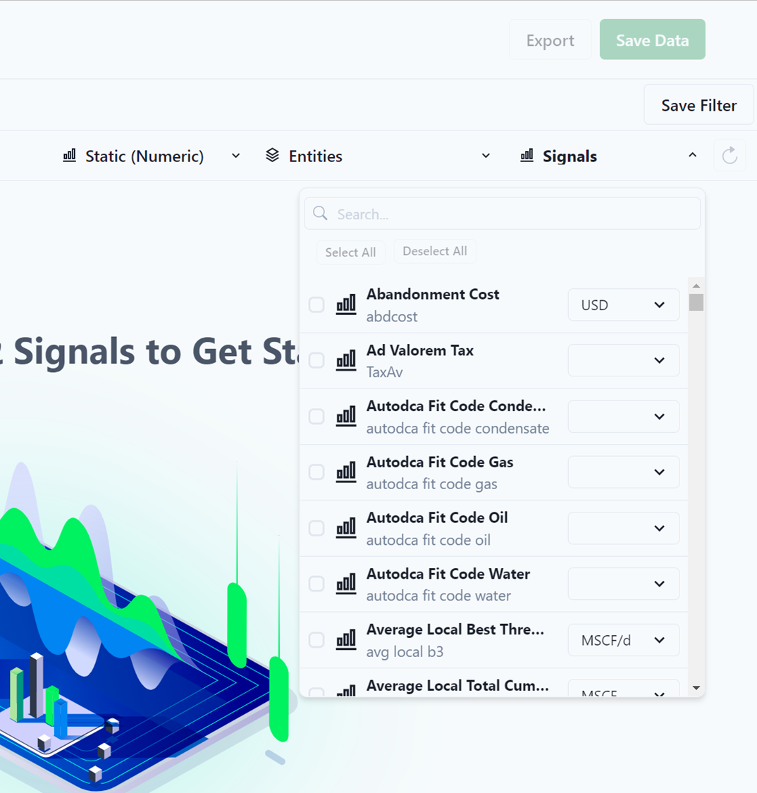
After a signal is selected, the user has the option to modify the unit system required for visualization.
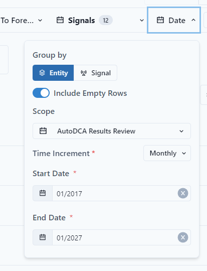
Date
When working with time-based signals, the user needs to define the time range to be used for analysis through the Date button. In addition, the user has the option to include/hide empty rows, change the format of the column headers, and modify the time increment of the data for analysis (e.g., daily, monthly, yearly, etc.).
After selecting the appropriate entities, signals, and time range (for time-based signals only); the user can start analyzing the data through Tables, Statistics and Charts.
Save View
To save any New Search, click on the Save Filter button to store it within the Workspace. In addition, the data can be exported through the Export button.

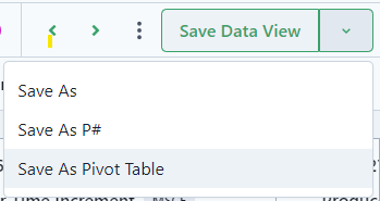
Save As a P# Script or a Table
If you want to perform analysis on the data, you would save the data as a P# Script. If you want the data to connect to Power BI, save the data as a Pivot Table. In order to save as something other than a Data View, use the dropdown to select.
Export
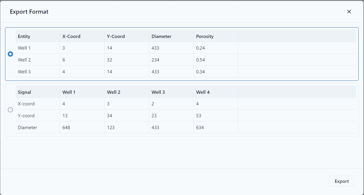
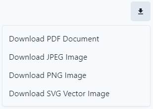
Data Views can be export as a CSV file. To export, select Export at the top right of the page.

After clicking the export button, the user can determine the format for export by selecting the button next to the desired format.
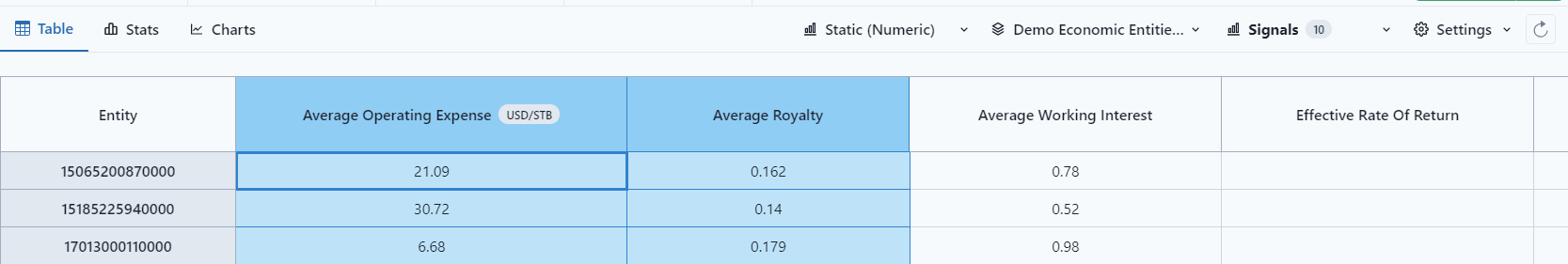
Table
The data for the selected entities, signals and time range is presented in table format for visualization.
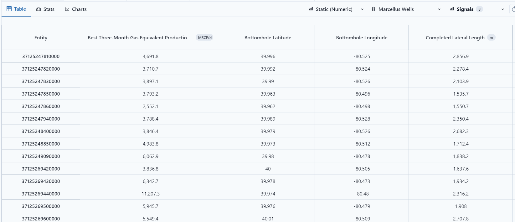
To view specific columns in "Stats" and "Charts," select the columns by clicking to highlight.
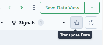
Transpose Data
Data can be transposed in the table by selecting the transpose button.
Stats
Statistical analysis is available to provide insight and help identify underlying patterns, trends, and outliers for any signal in the data model.
To select a signal or entity for analysis, simply select it from the drop-down menu.
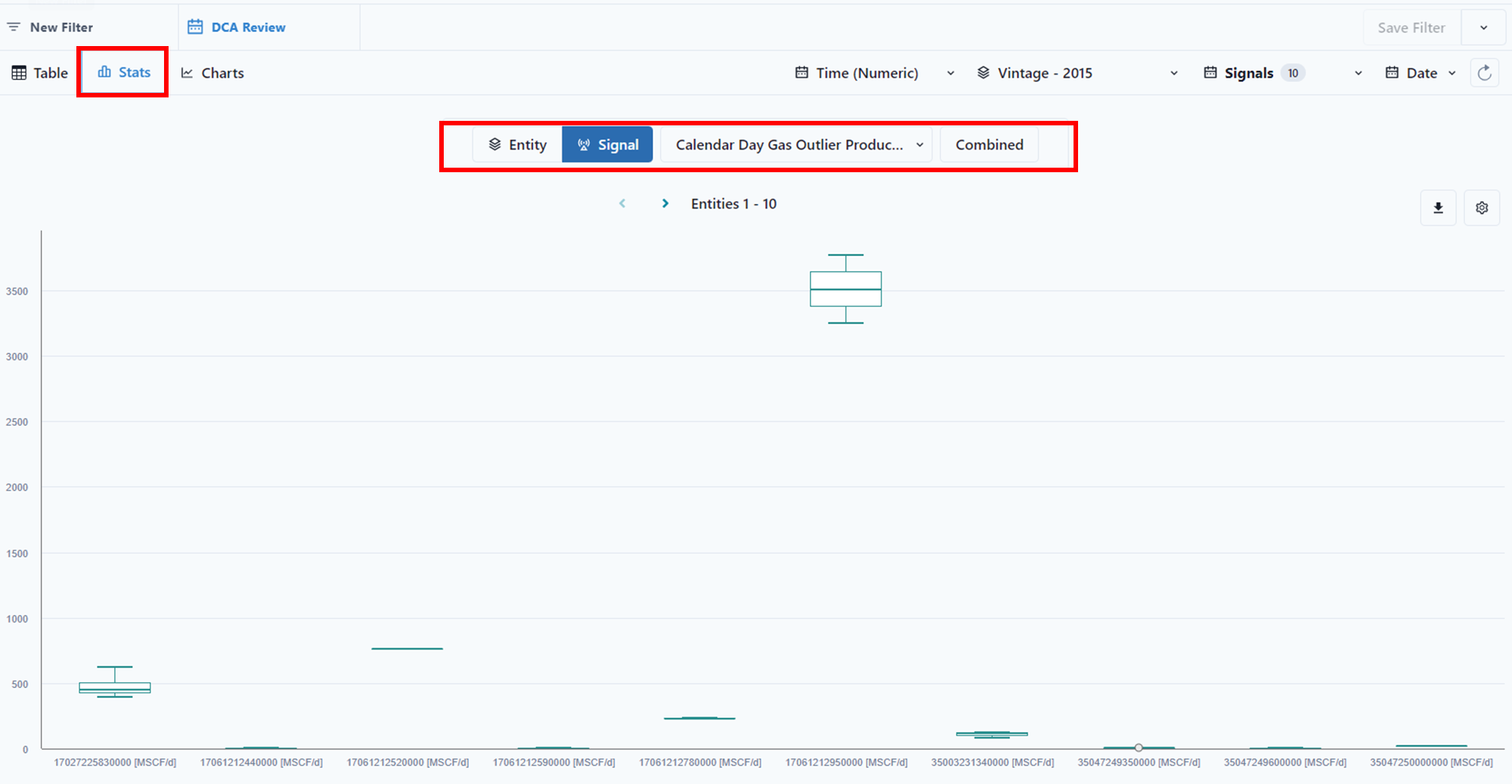
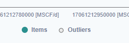
The legend at the bottom is used to toggle both Items and outliers on/off from the Box Plot.
The Stat can be downloaded through the download button.
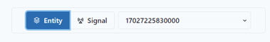
Signals can be stacked together in a single Box Plot by clicking on the Combined button.

Alternatively, individual entities are also available for analysis in the Box Plots by clicking on the Entity button and selecting the appropriate entity using the drop-down menu. Entities can be searched by name or by alias.
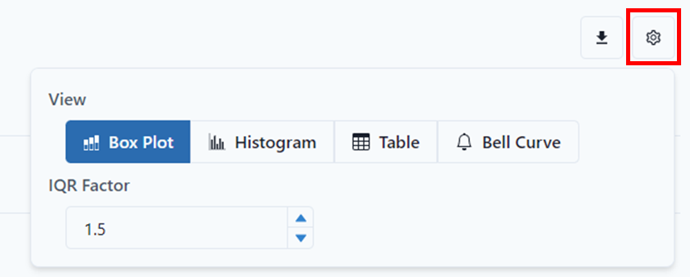
To select a different view for statistical analysis and to modify the selected IQR Factor for outlier identification, click on the highlighted gear button. In addition, the data is available for Export through the highlighted Download button.
The Interquartile range is defined as the difference between the third and first quartiles in the sample.
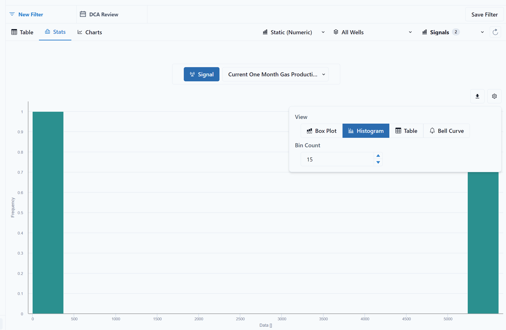
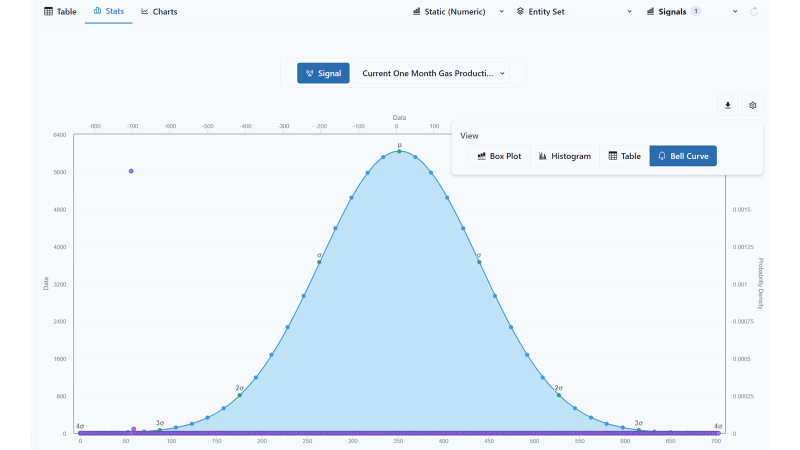
The Stats can be viewed as a Box Plot, Histogram, Table, or Bell Curve. The user should click on the Gear on the right of the screen.
To select a Histogram View, click on the Histogram button.
To select the Table view, simply click on the Table button.
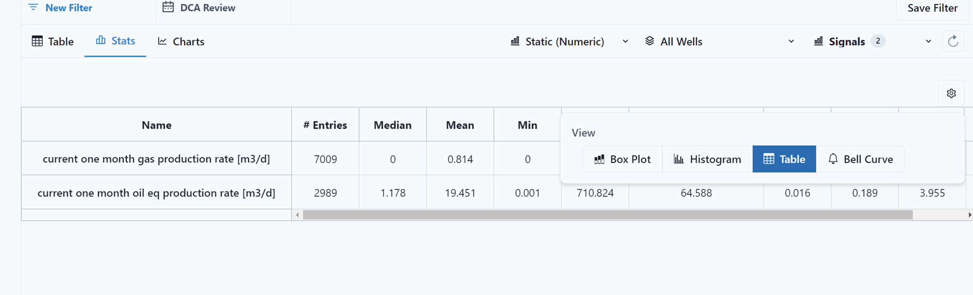
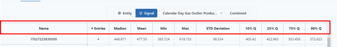
The Table view provides a statistical summary of the selected entities and signals. The summary includes sample size, average, median, mean, min, max, STD Deviation, and quartiles. In addition, the IQR Factor can also be modified through the Table’s option menu.
To view the Bell Curve, Select the Bell Curve tab.
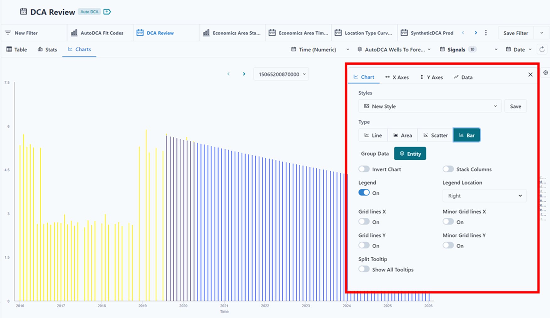
Charts
Data for the selected entities and signals can be visualized using different chart types. To visualize data, simply click on Charts.
To export the data, simply click on the Download  button. In addition, the user can toggle on/off any charted entity by interacting with the highlighted legend.
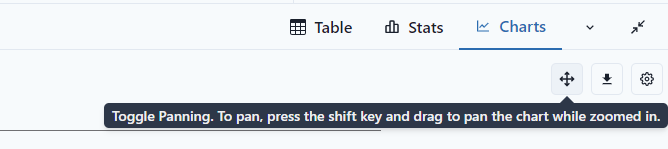
To enable panning, click the button next to the download.
To modify the Chart settings, simply click on the Gear  button.
The user has the option to Group data by either Signal or Entity depending on the data type. Simply click on Group Data and use the drop-down menu to select the appropriate signals or entities. The user can also add features to the graph: Legend, Grid lines and Tool Tips. The user can also change the chart type to Line, Area, Scatter, or Bar.
"Invert Chart" switches the x and y axis, which is very useful in viewing depth information.
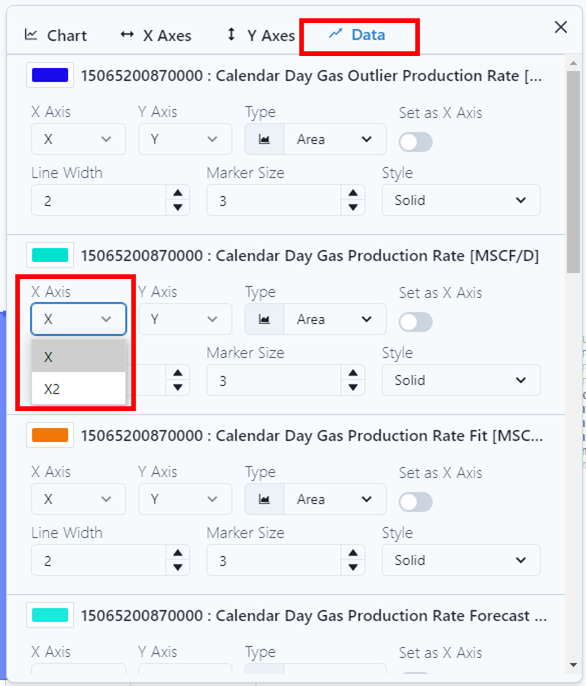
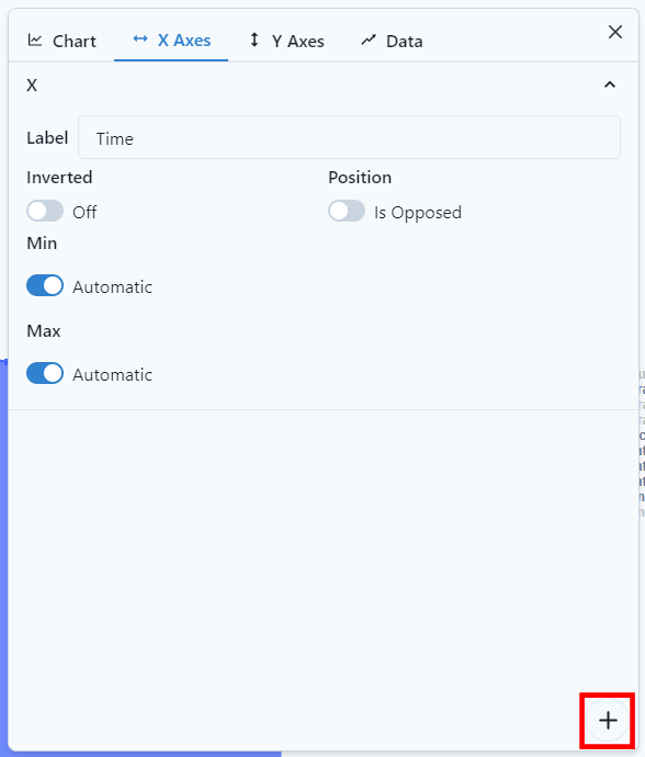
The Chart can also have additional X and Y Axes. Once an additional axes are added, each series may be assigned an x and y axis.
To create an additional axis, click on either "X Axes" or Y Axes". In the Screen, there is a "+" at the bottom. Click to add an axis.
Label the Axis. Notice, once the axis is added, it is shown at its corresponding axis.
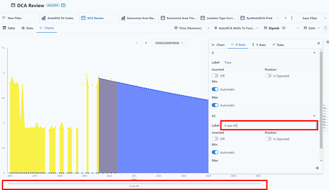
On the Data tab, each series will have to be assigned to the appropriate axis. Different formats for each entity can be selected in the Data tab.