The PetroVisor Asset Performance Dashboard displays operational performance for a specific asset.

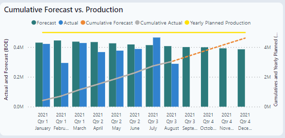
Cumulative Forecast vs. Production
This graph uses Forecasted Oil vs Actual Production. The forecast can use the PetroVisor DCA or client specific forecasts.
Total
This chart compares costs by CAPEX, Workover, LOE, P&A and total. It also will sort by a specific area to look at details. The graph is useful to compare budget vs actual and trend against forecast.

Monthly Total Workover (without P&A)
This chart is specific to workovers, comparing by month AFE with field tickets and actuals. The chart can be sorted by Gross and Net.

Workover Results - Gross Oil and Gross Gas by Day Index
This chart displays the production impact of a workover from "Day 0." Day 0 is the normalized day for the start of production after workover completion. The graph can be sorted by Producing and Calendar days as well as by a specific well. This chart is useful to quickly evaluate the post workover production performance. 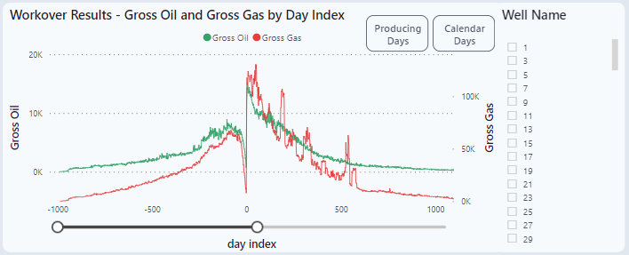
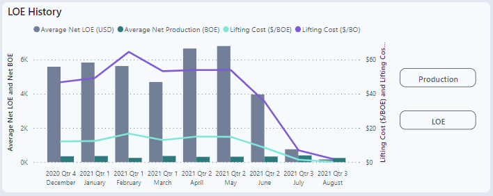
LOE History
This chart compared LOE history and lifting cost per barrel against average production. Two calculations are used in this chart.
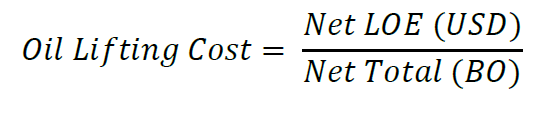
and
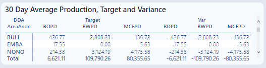
 30 Day Average Production, Target and Variance
This table looks more into detail of the production data displayed on the dashboard. It provides the latest 30-day average of actual production, forecasted production, and variance (actual - forecast) for the three producing phases:
- Oil in BOPD
- Water in BWPD
- Gas in MCFPC
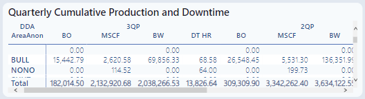
Quarterly Cumulative Production and Downtime
This table provides quarterly cumulative production volumes for three producing phases:
- Oil in BO
- Gas in MSCF
- Water in BW
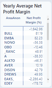
Yearly Average Net Profit Margin
This chart provides a ranked list of the most profitable production areas.